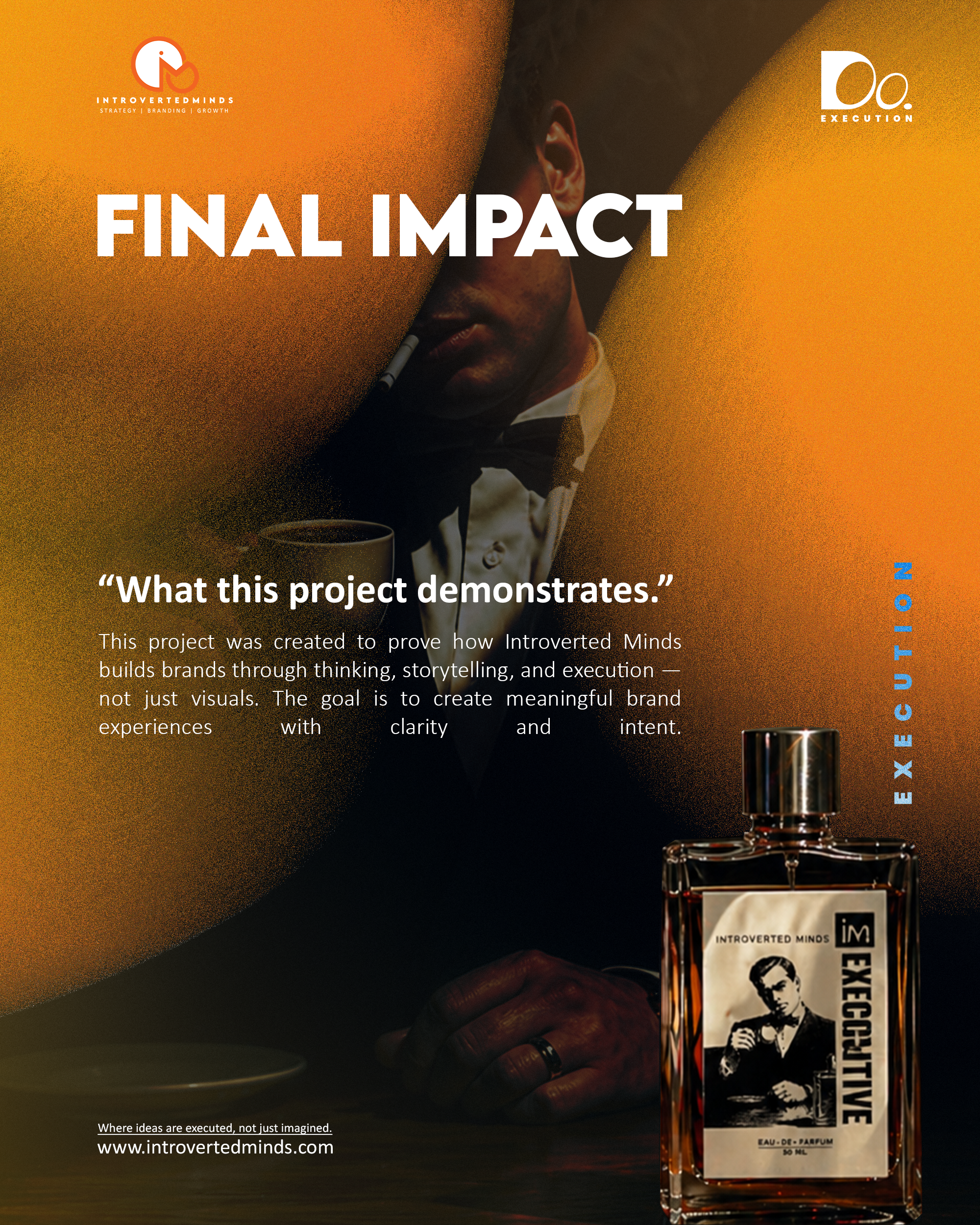
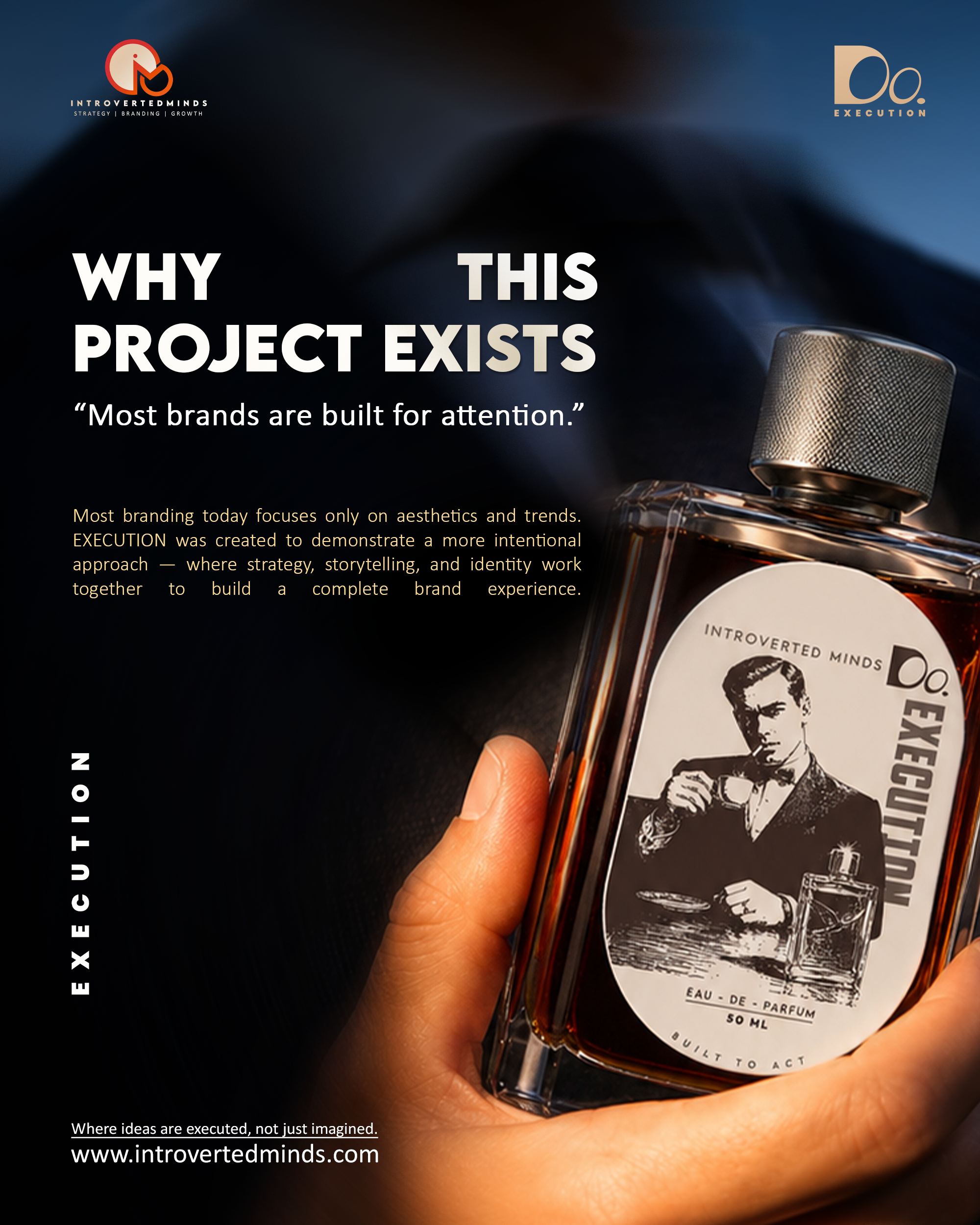
Inside the making of EXECUTION — a concept fragrance brand built from strategy to shelf, proving that the brands that endure don't sell products. They sell an entire way of thinking.
Most branding today focuses only on aesthetics and trends. Beautiful gradients. Expensive fonts. Moody photography. And absolutely nothing to remember the moment you scroll three posts down.
EXECUTION was created to demonstrate a more intentional approach — where strategy, storytelling, and identity work together to build a complete brand experience. Not just a product. A point of view on the world.
This project by Introverted Minds exists to prove that the brands worth remembering aren't the most expensive ones. They're the most disciplined ones.
Open any social feed and you'll see the same pattern: brands pouring money into aesthetics without a single coherent thought behind them. Most brands have confused looking premium with being premium — two entirely different things.
Premium appearance is a tactic. Premium identity is a strategy. One requires a good designer. The other requires a clear point of view on the world — and the discipline to express it through every touchpoint, without compromise.
This is the distinction EXECUTION was built to demonstrate. Not louder. Not more expensive. More intentional.
What most brands do
Build visuals.
Hope meaning follows.
What EXECUTION does
Build meaning first.
Let visuals carry it.
"Branding that only chases attention is renting space in the consumer's mind. Branding built on identity owns it."
Introverted Minds — Brand Strategy
"This is not a fragrance
for attraction.
It's a fragrance for
action."
EXECUTION is inspired by espresso as a mindset — focused, concentrated, and intentional. The brand represents discipline, clarity, and action without hesitation. Not attraction. Not seduction. Precision.
The brand doesn't chase trends. It holds a position and every visual, word, and material choice reflects that same commitment to standard.
No confusion in the identity. The name, the packaging, the visual language — all pointing in one direction. When a brand is clear, the consumer doesn't need to be told what to think. They feel it.
EXECUTION isn't a collector's item. It's built for doers. The fragrance rewards those who move with intention. A ritual before the work — not a reward after.
The first post established visual standard without explanation. No product description. No features listed. Just immaculate product visualization with one line of copy:
"Every reflection, angle, and shadow is intentional."
This is AI-directed product visualization — crafted to feel clean, premium, and production-ready. Not generated randomly. Directed with purpose.
Because great product photography isn't only about showing the product. It's about controlling perception.


Every luxury perfume brand uses the same visual vocabulary: white boxes, gold foil, delicate serif fonts. It's a codified language that signals exclusivity — and it's been so overused it no longer signals anything at all.
EXECUTION asked a radical question: what if the packaging looked like it belonged on a different shelf entirely?
The answer was a dark roast coffee bag structure — matte, industrial, dense. Every choice communicates something traditional luxury packaging cannot: this brand is about what you do, not how you look.
"The bottle should feel like a tool, not an accessory. The packaging should feel like part of the ritual."
This is cross-category inspiration as a strategic tool. By borrowing the language of coffee packaging, EXECUTION transferred associations of discipline and focused ritual to a fragrance without having to earn them from scratch.

Brewed for Execution.
When your packaging borrows from a category your audience already trusts — and brings that trust into a new space — you don't just differentiate. You own the conversation.
Day three deepened the packaging narrative — moving away from traditional luxury perfume boxes and taking inspiration from premium coffee packaging. Raw, structured, and functional.
Because the brand isn't built around decoration. It's built around discipline, focus, and execution.
This is what happens when packaging becomes part of the brand story — not just protection, but positioning.
The project was built through strategy, identity design, product visualization, and cinematic storytelling. Every element — from lighting to typography — was designed with purpose and precision.
Not a single detail was left to chance. The visual language, the packaging structure, the copy direction — all of it served one brief: prove that a brand built on a mindset is more powerful than one built on aesthetics alone.
"Every element from lighting to typography was designed with purpose and precision."
The EXECUTION campaign didn't launch with a product. It launched with a point of view. Each day was designed to build a specific layer of brand understanding — adding meaning progressively, never repeating, always advancing the story.
The first post established visual standard without explanation. No product description. No features. Just immaculate product photography with one line of intent: "Every reflection, angle, and shadow is intentional." The audience's first impression wasn't what the product was — it was that whoever built this cares deeply about craft.
The second post introduced the coffee-bag packaging with the cross-category philosophy. The post didn't just show the packaging — it explained the design thinking: "The bottle should feel like a tool, not an accessory." This is brand education that creates advocates, not just customers.
Day three deepened the packaging narrative. "Not your usual perfume packaging." The audience now understood they were watching something be built — not just sold. This positioned EXECUTION as a category disruptor, not a product launch.
The final campaign video — where strategy, identity design, product visualization, and cinematic storytelling came together. "A perfume brand should sell a mindset, not just a fragrance." Every previous post wasn't content. It was foundation-building.
The EXECUTION project demonstrates a replicable framework for building brands with clarity and intent. Here's the anatomy of what makes a brand intentional — not just aesthetic.
Before anything is designed, define the mindset the brand represents. Not what the product does — what the brand believes. For EXECUTION: espresso as a psychological state — focused, deliberate, complete.
A product without a story is a commodity. EXECUTION has a story: most brands are built for attention; this one is built for action. That contrast creates tension — and tension creates engagement.
Design choices in EXECUTION are strategic positions, not stylistic preferences. Dark matte packaging = intentional, not decorative. Industrial typography = functional, not flashy.
The visual direction isn't decoration — it's vocabulary. Deep amber light, precise angles, intentional shadows. Every image speaks the brand's language without a caption.
Ideas without execution are just plans. The EXECUTION campaign delivered proof — not just concept. When you can point to a complete campaign and say "we built this" — the brief sells itself.
| Dimension | Attention-Seeking Brand | Identity-Led Brand (EXECUTION) |
|---|---|---|
| Starting Point | What should this look like? | What does this brand believe? |
| Packaging Logic | Follow category norms. Feel premium. | Break category norms. Communicate mindset. |
| Photography Brief | Make the product look expensive. | Make the product feel like a decision. |
| Copy Direction | Describe the product's benefits. | Communicate the brand's worldview. |
| Campaign Goal | Generate impressions. | Build understanding and belief. |
| What's Remembered | The product, if anything. | The idea the product represents. |
| Repeat Purchase Driver | Discount or novelty. | Identity alignment. "This is who I am." |
| Long-Term Position | Always competing on price/reach. | Owns a mindset. Price-inelastic. |
The final execution video — where strategy, identity design, product visualization, and cinematic storytelling came together. From coffee-inspired packaging to disciplined visual direction, every detail communicates execution.
Concept Brand by Introverted Minds.
Where ideas are executed,
not just imagined.
The Takeaway
EXECUTION was built to prove one thing: the brands that endure aren't the ones with the biggest budgets or the most followers. They're the ones with the clearest point of view — and the discipline to express it without compromise, in every single detail.
That's what Introverted Minds builds. Not just visuals. Not just campaigns. Complete brand experiences — with clarity and intent.